

Why Color Feels Complicated (And Why It Doesn't Have to Be)
Most people weren't taught color theory — they were just told certain things matched and others didn't. Over time, that creates a kind of paralysis in front of the closet: you have clothes you like individually but can't seem to combine confidently. The good news is that effective color coordination doesn't require an art degree. It requires a few practical principles applied consistently.
Think of color coordination less as a set of rules and more as a toolkit. You'll use different tools for different situations, and over time the decisions become instinctive. If you're simultaneously working on building out your wardrobe, our foundational wardrobe guide covers the core pieces worth investing in first.
Start With a Strong Neutral Base
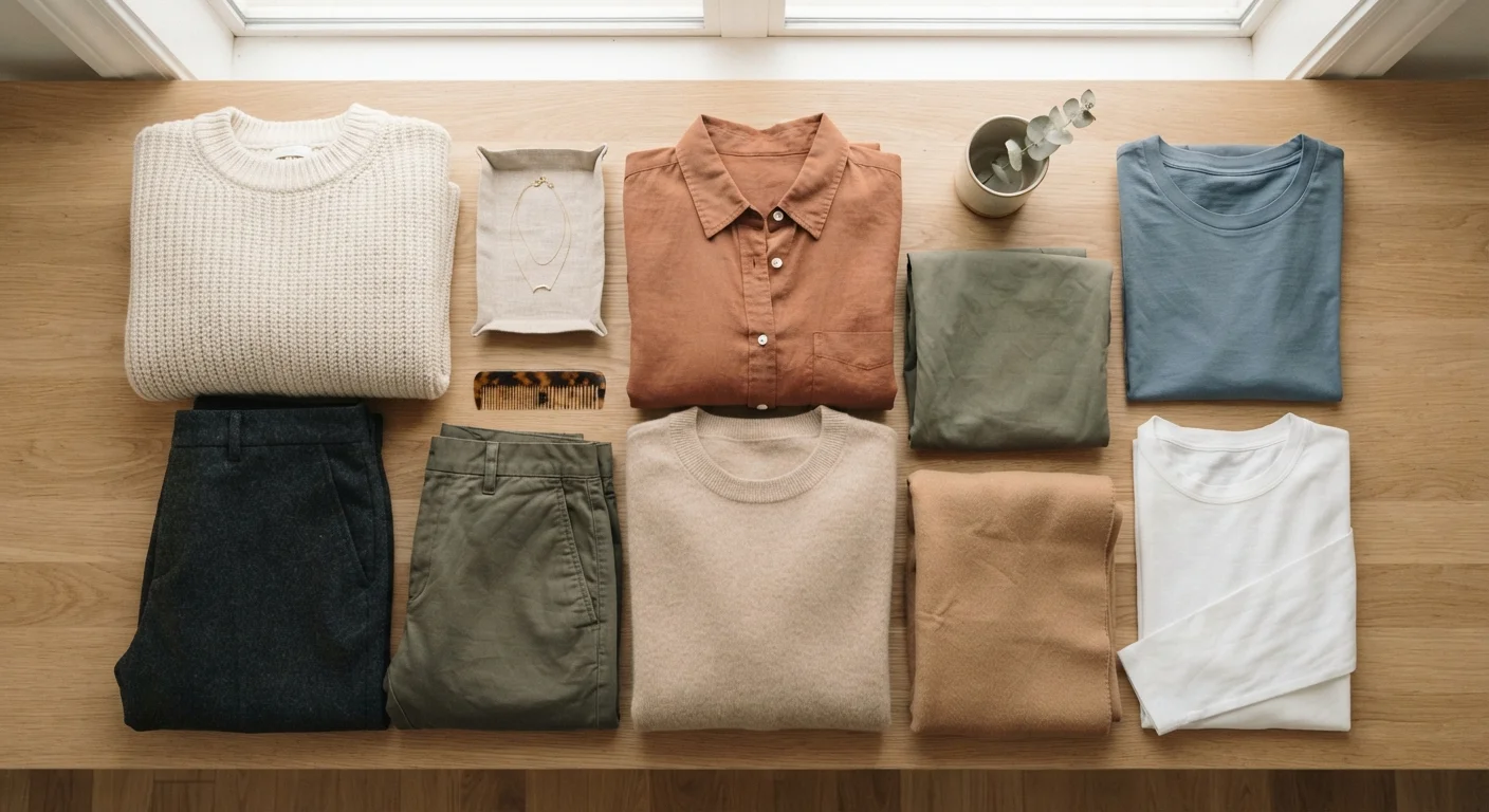
Neutrals are the backbone of easy dressing. Colors like white, black, navy, camel, grey, and olive work because they reflect light in ways that don't clash with most other hues. When the majority of your wardrobe is built from neutrals, adding color becomes a deliberate accent rather than a gamble.
Anchor every outfit with at least one neutral piece.
Neutrals act as visual anchors that prevent outfits from feeling busy or unresolved. They give accent colors room to stand out without competing. When you're unsure, defaulting to a neutral foundation almost always produces a wearable result.
Identify two or three colors that reliably flatter your undertone and make them your go-to accents.
Limiting your accent palette reduces decision fatigue and means your wardrobe naturally coordinates better over time. Fewer variables mean fewer morning mistakes. It also makes shopping more focused and less impulsive.
Use contrast intentionally to shape the overall impression of an outfit.
High contrast reads as polished and defined, making it a reliable choice for professional or structured settings. Low contrast feels more relaxed and tonal, suiting casual or creative environments. Choosing contrast deliberately means you're shaping how the outfit communicates.
Treat pattern as color — account for all the hues in a print when building an outfit.
A printed piece isn't one color — it's several. Ignoring the secondary colors in a pattern often leads to outfits that feel accidentally busy. Pulling one of the pattern's less dominant colors into a solid piece elsewhere in the outfit creates cohesion.
Test new color combinations in natural light before committing.
Artificial indoor lighting — particularly warm bulbs — can distort how colors relate to each other and how they appear against your skin. What looks coordinated under a bathroom light may look mismatched outdoors. Natural light gives the most accurate read.
If your closet currently feels like a guessing game, it may be worth revisiting which pieces you actually own. Our wardrobe essentials reference can help you see where neutral staples might be missing.
Undertones: The Hidden Factor in What Flatters You
Two people can wear the same shade of yellow and have dramatically different results — and undertone is usually why. Skin undertones are generally described as warm (golden, peachy, or yellow), cool (pink, red, or bluish), or neutral (a blend of both). Clothing colors also carry undertones, and when they harmonize with yours, the effect is that your complexion looks clearer and more even.
Undertone Is a Spectrum, Not a Box
Many people fall somewhere between warm and cool — often described as 'neutral' undertone — and can wear a wider range of colors comfortably. Undertone is a helpful starting point, not a rigid rule. If a color makes you feel good and you consistently get positive feedback wearing it, that's more reliable than any categorical label.
A simple starting test: hold a piece of gold fabric and a piece of silver fabric near your bare face in natural light. If gold looks more harmonious, you likely lean warm. If silver flatters more, you likely lean cool. This isn't a clinical method — it's a practical shortcut that works for most people most of the time.
Once you have a general sense of your undertone, you can start noticing patterns in which colors in your existing wardrobe consistently earn compliments — and which ones you always feel slightly off in.
“Color is the keyboard, the eyes are the harmonies, the soul is the piano with many strings. The artist is the hand that plays, touching one key or another, to cause vibrations in the soul.”
— Wassily Kandinsky, Artist and art theorist, author of 'Concerning the Spiritual in Art'
Contrast and the Three-Color Principle
Beyond matching, contrast — the difference in lightness and darkness between pieces — shapes how an outfit reads. A high-contrast outfit (dark trousers, light top) feels crisp and defined. A low-contrast outfit (tan top, khaki trousers) feels softer and more tonal. Neither is wrong; they create different visual impressions.
90 sec
Average time spent choosing an outfit daily
Research on decision fatigue suggests that simplifying color choices can meaningfully reduce morning stress and mental load.
3
Colors in an effortlessly cohesive everyday outfit
Fashion educators and stylists commonly cite the three-color guideline as one of the most practical and durable rules for everyday dressing.
A useful guardrail for everyday dressing: keep most outfits to three colors or fewer. That includes neutrals. A white shirt, dark jeans, and a warm terracotta jacket is a complete three-color look. Adding a fourth distinct color can work, but it requires more deliberate balancing. Keeping it to three makes the outfit feel cohesive almost automatically.
These principles connect directly to broader ideas about fit and proportion. When you're also thinking about how clothes sit on your body, our article on dressing for your body pairs well with what you're learning here.
Quick Wins to Apply Right Now
Color coordination becomes much easier when you have a few reliable go-to combinations already tested and trusted. Rather than experimenting every morning, build a small mental library of pairings that consistently work for you — then branch out from there when you have more time and energy.
For a deeper look at which style principles are genuinely worth following versus which are outdated, see our guide to style rules that hold up. Color coordination is one area where a little structure genuinely helps — and most of the classic guidance still applies.
The content on this site is for informational purposes only and is not a substitute for professional advice. Always consult a qualified professional for guidance specific to your situation.